Thursday, 10 December 2009

Time Capsule - Decisions decisions

I have been looking at Russian Constructivism and Italian Futurism while researching what to do for my time capsule.


The two images are my favourite images I've found so far from each movement. Both of them are bold and colourful (although the example of futurism above isn't colourful, but I still like it)

I think I will do futurism so I am not the second person in the group doing constructivism and also because I don't know much about it and I'd like to learn a bit more.

From looking at the books on futurism it looks as though there are 6 key 'Futurists': Luigi Russolo, Carlo Carra, F.T. Marinetti, Umberto Boccioni, Gino Severini and Antonio Saint'Elia.


Boccioni's The City Rises 1910
I initially thought this was a war scene, and that 'the city' was revolting but apparently its actually a busy scene showing everyone getting up for work, building new buildings, steering horses and going to factories.


The Revolt also by Boccioni IS actually about the people of the city rising up in protest. This was painted the year after, and is much more abstract, showing a 'red wedge' of red people who's dynamism and feeling of protest is shown penetrating the city by the bright red 'waves' that fill the picture.


The Street Light by Giacommo Balla was inspired by the new electric street lighting in Rome. Balla is depicting the way the controversial new lights outshone the moonlight, using chevrons of colour to illustrate the energy pouring out of the electric bulb.


Unique forms of Continuity in Space was one of Boccioni's later pieces. It is a bronze sculpture which shows the movement of a human with 'modelling of the atmosphere',  as he called it, around the figure. I like the way he has abstracted the human form to a point where it has no face obvious arms, but you can still tell that it is striding forward. I saw this in a gallery in London a few years ago and i remember liking it but I didn't really understand what it was meant to be, but I remember it being quite scary looking, like a futuristic robot.


Friday, 27 November 2009

NEW PROJECT - Time Capsule!

In this project I will create a themed time capsule based on an artistic movement or artist/designer. In the box I will include 
  • At least 1 A3 poster advertising my movement or artist
  • A colour leaflet about the movement or artist
  • An essay in a booklet form.
  • Postcards for illustration.
In addition the actual box will be themed in the same way as it's contents.

I will be using the Photoshop, Illustrator and new, InDesign! So that I can lay out the essay and leaflet properly.

Friday, 20 November 2009

making la box

The 3D representation in Illustrator

Making the nutritional information with the white arrow tool.


After having problems mapping the art to a 3D box i decided to cheat and use photoshop to map the art onto a plain 3D box, using the distort free transform tool.


these are all the symbols I used in my box.I used the make envelope tool on the text, before making it 3D and glowing. I thought that a green and white colour scheme for this section, which is reflected on the right side and the back, would help to convey the healthy message of less salt - similar to the whole grain green banner used on Nestlé cereals.

Monday, 9 November 2009

3D Practice

After reading some of the second years' blogs, I wondered if illustrator would be able to handle putting my design on a 3D box with all the paths, gradients and effects I've used, so i decided to have a practise go. Whenever I tried to make a symbol for the back and the front, to put in the 3D shape, illustrator crashed. I managed to do it by saving the designs as high quality jpegs and then importing them back in and turning them into symbols, then mapping them onto the 3d box, which worked well.
Posted by Picasa

Fish Back

The Back of the box

The top hippo is underwater now, becuause it's talking about holding its breath.
Posted by Picasa

Making my box

Front of the box
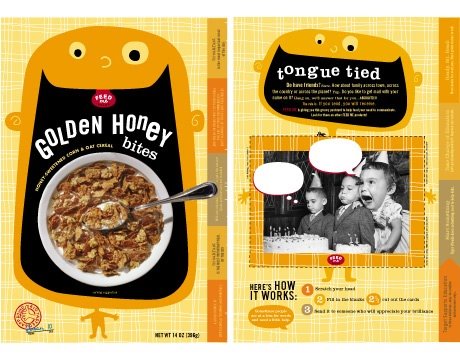
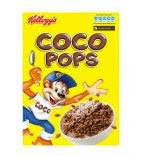
This is a screenshot of all the files I've saved so far of the front of the box. The font I have used to spell 'Hipp0s' is similar to the font used on 'Coco Pops', which has the same target audience as my Hippos. I changed the name from Harry Os to make it more simple, and so there's a reason for the picture of the purple hippopotomous (even though coco monkey or tony the tiger or anyone don't make much sense anyway) The first and most recent version is nearly finished, I just need to add the weight and a short description of the cereal.
Back of the box
On the back of the box I want to have a large nutritional information section for parents, about how healthy Hippos are, on one half, and the other half for the childeren. I've put a little did you know bubble, but I might include a wordsearch or maze or something, to make it a bit more interesting for childeren.

In the parent's healthy section I've used natural colours, and purple, to give it a natural look, and green ticks on the bullet points, similar to the ticks on Cheerios packaging, to signify that the cereal is good for childeren and the right thing to buy. The childish scribble effect on the background was nice, but made it a bit hard to read, so I will have to tone it down or revert to the plain version (bottom row).

Front, Side, Back
Without checking the dimensions, i have quickly put this together to check that the colours and shapes will work when the faces are mapped to a 3D box. I've also added the logo on the side of the box as I had planned in my sketchbook.

Alternative fronts
Experiments with different colours and layouts. The pastel colours in the top row I don't think would work on a cereal packet, as usually cereal is in bold, warm coloured boxes. And I prefer the way the hippo looks like he's eating the cereal in the original design.

Posted by Picasa

Tuesday, 3 November 2009

Typography Experiments


These are some experiments of typography and colours, with reference to Coco Pops

Cornflakes

I decided to look at different branded cornflake boxes, to look at the similarities between them, and their differences. They were Kellogs, Tesco, Waitrose, Sainsburys and Whole Earth organic cornflakes. The organic cornflakes are a bit of an anomaly in terms of the packaging design becuase they are marketed as a natural alternative to kellogs or supermarket own brand cornflakes.

The supermarket own brand boxes are all similar colours, red yellow and orange, which could be because supermarkets want their customers to recognize which product they want if they are in a supermarket they don't usually shop in.
Posted by Picasa

Wednesday, 28 October 2009

Cereal - 'Healthier'


The packaging for cereal marketed as being 'healthier' tends to have more subdued colours, and a simple design. Organic shapes like leaves and corn make is look all natural and lovely.
Posted by Picasa

Cereal - Childerens


If I chose to make a cereal box, I would have to consider which type of cereal to package. This is becuase there is a wide range of cereals available in the shops, with different target audiences and therefor different packaging designs. The most obvious 'genre' is Childeren's cereal, the boxes usually have a cartoon character on the front and a more colourful and bold design.
Posted by Picasa

Tuesday, 13 October 2009

Packaging Yourself - New Project


For this project I will be researching conventions used in product packaging and using them to make my own packaging based around my name. I will be looking at
  • Colours
  • Graphics
  • Typography
  • Logos
  • Layout
At the end of the project I will have produced a 3D representation of my packaging, made using Illustrator.

At the moment I am deciding between making a box for:

  • Tissues
  • Cereal
  • Tea
  • Ready meals
  • Cereal Bars
I think that the ready meal would be the hardest to make, because from looking at the Sainsburys, Iceland and Birdseye websites I've noticed that they all have photographs of the food on them, which would be hard to make as a vector image, without using live trace.

Tissues and tea would be easier, because they are not advertising how they look, because people don't really care what thier tea bags look like, and tissues all look basically the same inside the box.

From looking at the sainsburys website tissue section I can see that the graphics on tissue
boxes are mainly feminine colours and photos of soft things - feathers, flowers, water ripples etc. The main exception is the Kleenex 'Mansize' tissues, which are clearly marketed to men, with the dark, metallic look and block capitals reassuring customers that the new pack still contains mansize tissues.

Friday, 9 October 2009

Thursday, 8 October 2009

FIVE Panoramas


I now have 5 panoramas, in varying states of finishedness.
At the harbour I took photos in two places, on a boardwalk between two rows of new buildings and one one the beach between the sea and the harbour.

I need to decide which 3 to finish and use as my final pieces.
Posted by Picasa

Monday, 5 October 2009

First (almost) finished QTVR

After finishing my Towner Art Gallery panorama, I opened it on Real Viz to turn it into a Quicktime .mov file:


However when I panned around I noticed that the window frame in this section doesn't look right, it bends in the middle where two photos join, so I will have to warp the layers to change the sharp corner into a gradual curve.

Posted by Picasa

Garden Panorama

Today I took a third panorama outside in my back garden. I had been thinking of taking one there becuause it would show all the victorian terraced houses around where I live, which would be older than the Towner, but more modern than the castle. I took the images quickly as the sun was going down and I didn't want there to be too much difference in lighting between the photographs. But I like the orangey quality of the light, that's why I did it so late in the day, also, it was raining all morning.

I'm not sure if I'll use this panorama as a final QTVR becuase it's doesn't really fit in with my theme - the only buildings you can see are my house and the sheds. I still intend to make a panorama at Sovereign harbour, so I'll decide which to use after I've taken them.
Posted by Picasa

Friday, 2 October 2009

Towner Contact Sheet

Posted by Picasa

Towner EXPOSURE


I took two photos of this section to get detail both inside the building and out the window. Then I will use my layer masks to show the right parts of each one.
Posted by Picasa

Thursday, 1 October 2009

Towner Panoraama

My theme, I've now decided, will be the age of buildings, or something like that. The ruins of Pevensy Castle will be the oldest and then for a modern building I took a panorama in the Towner art gallery in Eastbourne. It's the most modern looking building I could think of and I thought it would be good if I could get the sea, and the building, in the shot.

However when I got there i found that the most photogenic side of the building, wasn't opposite the sea and the side facing the seafront was a bit boring. So I decided to take the 360 photo inside the building.


This is the corridor on the top floor of the building. I chose this location because I wasn't allowed to take any photos that had any artwork in, so it would have been impossible to have a 360 degree panorama in a gallery, without including any art. I also chose it because there was a large window at either end with views from quite high up.

On one side there was a rather long, plain white wall so I have cheated a bit by removing part of the wall, so that the viewer doesn't have to scroll through an empty, white space.

This is a contact sheet of all the photos I took which shows the plain wall:


I am going to take another panorama of a modern building, or buildings as I don't think that this one was very successful. I will take the next panoramic photo at the harbour, in Eastbourne because all of the buildings are fairly modern, and it is quite picturesque.

Wednesday, 30 September 2009

Pevensy Castle Panorama

I decided to take my first panoramic image at Pevensy Castle because I thought it would be interesting all the way around, as there is a Roman wall circling the site.

Here are my images laid out in order:
TADA


The spot I chose had a view of the castle and a lot of trees. Unfortunately you can't see much of the wall I wanted to include but I still think that the view is attractive all the way round.

I've added in some fake sky using the render - clouds option on photoshop because the blue sky above the castle turns into boring white as the panorama goes round. The pigeons happened to fly up just as I was taking the pictures, which was nice of them. I left them in by masking out part of the overlying layer.


Tuesday, 22 September 2009

Research into 360 Panoramas

After searching google for a bit I found 360vr.com which has some amazing examples of some very complex virtual reality panoramas such as this one from New Year's Eve in Times Square:


This panorama is especially immersive because it includes some audio of the New Year countdown.

Jook is an example of a photographer that takes these images. Here is his page on the 360vr website, where it is explained that he uses a fish eye lens.

These professional panoramas are taken using fish eye lenses, because the scope of the images they capture allow for less photographs to be taken to get the full 360 degrees, and therefore allowing more realistic panoramas, with less stitching and a more accurate recording of a place or event, especially if there is a lot of movement in the scene, such as the one above.

I also found this blog, Panoramablog.com which has a lot of images with lots of people and action in.

This panorama, again in New York, shows a mass pillow-fight from right in the thick of the action. All the way round there are people moving and feathers flying, but I can't find any joins between photos, which is impressive.

Here is a photo of the photographer and his camera in the crowd.

I like this panorama (the first on the page) , from the same blog, because, for the viewer, as you look around there are different things happening and you feel as though you are actually in the water with everyone else.


http://www.panoramablog.com/index.php?entry=entry090408-143048 Pillow fight

http://360vr.com/jook/ Jook