Saturday, 11 December 2010
Stained Glass Windows
My new idea is to use stained glass windows (made of acetate) for all the visuals in the advert.
Here is my second animatic which includes some of the artwork I've made:
For most of the 'windows' I designed them in illustrator to get nice curves and straight lines, then traced it with the outline paste on the acetate.

 Then i used glass paint to colour it in.


Chambord Chateau was hard to simplify for the stained glass window. I had to make it a lot more simple so i could paint it on the a4 acetate without having tiny blocks of colour for each turret and window.


Here is my second animatic which includes some of the artwork I've made:
For most of the 'windows' I designed them in illustrator to get nice curves and straight lines, then traced it with the outline paste on the acetate.


Chambord Chateau was hard to simplify for the stained glass window. I had to make it a lot more simple so i could paint it on the a4 acetate without having tiny blocks of colour for each turret and window.
Book Stop motion
To make the book open I used things to hold it up like this mug:

And then i just held it up with my hand, in two different positions so that I could mask one of the hands out in Photoshop.
Louis XIV

Louis XIV was quite easy to turn into a stained glass window. I found a painting of him on the internet, and used the shape of an existing stained glass window to make an outline around the image which fitted quite well. Then I drew the black outlines onto the image in illustrator, coloured it using live paint, printed it out, painted it on acetate, scanned it in, and changed the colours again on photoshop because the blue glass paint was really hard to mix and kept making everything black. For his face I just copied it in from the downloaded original painting and flattened out the colour to look like an etched pane of glass.
Raspberry

The Raspberry outline was taken from an image off the internet, and the background shape was taken from the box that Chambord Liqueur comes in:

I drew four diamonds to get a bit of variety and then copied them and blended them together to make a full 1280x720 pixel screen of them:

The gaussian blur on the background is to imitate a pull focus when the raspberry drops in.


Tuesday, 16 November 2010
Handmade Advertising
I've been looking on ibelieveinadv.com for recent handmade adverts. Here's some:
"Glassing. Sunglasses for immatures." Theres also a TV version


Not handmade, but uses textures to pretend to be.
MCEL MFW Mozambique Fashion Week: National Geographic
Source


The American Cancer Society: Am I Collective, Dan Funderburgh


Maximidia show how the cutting edge of today will quickly fade to old fashioned and out of date by illustrating them 1950s(?) style. The illustrations are very contempory but I don't think the text looks authentic enough, it looks like vectors and the strokes on Skype and Twitter look too modern.
Omo Washing Powder: Dirt is Good


"Glassing. Sunglasses for immatures." Theres also a TV version

Childish hand-drawn picture would stand out against other adverts and make the brand look fun.
Volkswagon. The Road

Don't know what this is trying to say, but they've used textured images to look all nice and touchy feely.
BBC Knowledge 'Honk if you're human'
Usave 'Live Fast Save Young'
Not handmade, but uses textures to pretend to be.
Source


I love these! The colours look extra vibrant next to each other. I don't know how these were made, but I like it.

VERY hard to read but looks nice up close. Like the fade from happy colourful on the left to grey horrible smokey land on the right.
Maximidia
From Ibelieveinadv
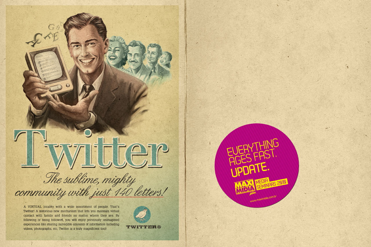
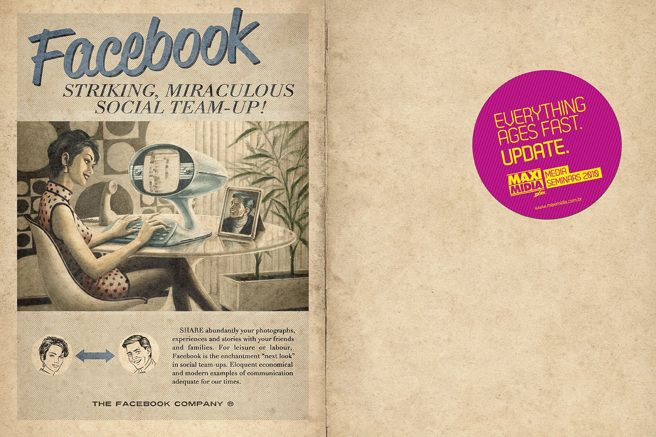


Maximidia show how the cutting edge of today will quickly fade to old fashioned and out of date by illustrating them 1950s(?) style. The illustrations are very contempory but I don't think the text looks authentic enough, it looks like vectors and the strokes on Skype and Twitter look too modern.
Omo Washing Powder: Dirt is Good

Omo (Persil) have really gone to town with the handmade splashy, textured, 'real' paint idea that the brief talks about. Without making the image 'for real' the advert wouldn't work, you can never really get the look of 'dirt' by purely using software.
CEAT SUV Radials
Takes the wild out of the wilderness


Uses happy, friendly, childish plasticine to show how SUVs "take the wild out of the wilderness". Nice artwork to make you think SUVs are too.
TETLEY
With this advert Tetley are going back to their old, well known advertising campaign that they abandoned in 2001, the Tetley Tea Folk. The graphics may be clearer now, with digital effects like the semi transparent tea and the distorted reflection in the tea urn, but they still look hand drawn and hand painted.


Monday, 1 November 2010
Handmade
In this project I will be making 'real' artwork, by hand and then using the computer to turn it into:
I will use an existing brand of alcoholic drink, with its current packaging and logo in the advertisements.
The adverts need to look hand made and old fashioned.


 in the Loire Valley in France.I think it would be fun to design adverts that incorporate the super spangly packaging, and the french chateux(s?) with gilded text, turrets, crowns and spiral staircases.
Turrets on top of the Chateau:

The only screen based advert i can find for Chambord is this one:
It's to be shown in Toni & Guy over the Christmas period of this year. Bit too classy and simple for my taste. I'd prefer some more tack like the bottle. But I suppose for an advert in a hairdressers it needs to not be too annoying or distracting.
Poster advert. "21st Century"

- 30 Second Animated Advert
- Billboard Advert
- Full Page Magazine Advert
I will use an existing brand of alcoholic drink, with its current packaging and logo in the advertisements.
The adverts need to look hand made and old fashioned.
I expect to use a combination of Photoshop, Illustrator and After Effects, and maybe a stop motion program.
Which Drink?
I went to Waitrose and was surprised by how many of the drinks are old fashioned looking anyway. Here's some that I liked the look of:

When we got the brief I thought of doing Australian wine so I could use images of kangaroos and surf boards. Unfortunately all the Wine labels were really boring compared to the beer and spirits so that put me off. Maybe it could be a challenge to try and make boring wine bottles look exciting?
Fentimans:


I like these because they are very obviously using Victorian styling on the lables and the names like Dandelion Lemonade are well old fashioned.
"Our Botanically Brewed Beverages are, to this day, a step back in time."
Says their American website.
Adnams Broadside:


Like the boats and colour scheme.
SOL


Sol would be an easy one to do because they're already using handmade looking, old fashioned imagery (like on their website above) I really like their logo and branding, and I could use mexican things like the beetle and cacti and things that people will think are cool.
Chambord

.jpg/395px-Chambord_Bottle(frontclose).jpg)
Chambord is a liqueur packaged very extravagantly in an orb shaped bottle with a crown on top, looking out a window in an expensive looking box, even though it costs £6.46.
Apparently it is inspired by a drink made of raspberries that King Louis XIV had in 1685 when he visited Chateux Chambord:

Turrets on top of the Chateau:


The only screen based advert i can find for Chambord is this one:
It's to be shown in Toni & Guy over the Christmas period of this year. Bit too classy and simple for my taste. I'd prefer some more tack like the bottle. But I suppose for an advert in a hairdressers it needs to not be too annoying or distracting.
Poster advert. "21st Century"

Tuesday, 19 October 2010
Finished Animations / Sound / Evaluation
Choosing the soundtracks for my animation was harder than I expected. All my tracks had to be edited to fit the 15 - 20 seconds which was challenging because you have to be careful where the music stops or it will sound like it just finishes in mid air. Using the last 20 seconds of the song helped but then the start was an issue.
Snake Splatter
For my Snake Splatter video I used a great part of Gwen Stefani's Yummy at the end which is just drums and sound effects of drills and things. As a storyboarded this animation before choosing the music I had to make the sound effects fit the action, the wrong way round. I had to change some of the actions so that they would work well with the music.
Using audacity, I cut the music off before the trumpets came in and then copy and pasted the end of the song which has the WEE! sound effect for the exploding square. It took some nudging backwards and forwards to make it sound right but I managed it quite well i think.
Lightning Tree
Again, for this video, I took the end of the song clip and pasted it onto the end of my composition. This was for the sound effect of Lady Gaga's face burning up, or in my video, the tree returning to the ground. I'm really pleased with how this dramatic music works with my scene. The lightning flashes were timed with the loud drums in the soundtrack using markers in After Effects, and I chose the music before I storyboarded or even decided what my idea was so I managed to get a good match between visuals and sound.
Shoes
Although I like this song (again i used the start and the end pasted together) I am not at all happy with the animation. I spent too long on the first two and ran out of time to make this one any good. I tried to hide the fact that nothing really happens with a shape that changes colour to the music but it didn't work. To do this I used the hue rotate effect - which i pick-whipped to an audio levels layer that I made using the 'make audio into keyframes' tool.
Overall I am quite happy with what I did. Hopefully my first two animations make up for the third. I learned a lot about after effects and I'm looking forward to using it on more complex footage.
I do have some screenshots but blogger wont let me upload any pictures :(
Sunday, 17 October 2010
Alejandro / Lightning
I've chosen another purely percussion soundtrack for the second animation. I didn't do this on purpose but after listening to loads of bits of songs looking for a suitable 20 seconds I found that it was hard to cut a piece of music in the middle of a melody without it sounding like it's obviously been cut.
The section of music is taken from the Lady Gaga video for Alejandro:
Auto starts at 0:48
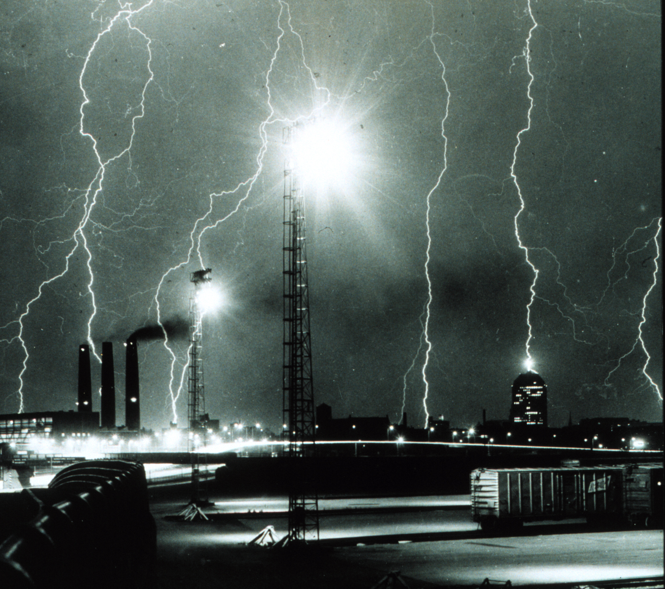
These pictures show the kind of look i'm after:

I really like these black and white pictures of lightning storms. I will synchronise the drums in the soundtrack with lightning flashes on screen.


Thursday, 14 October 2010
Splats research
After showing Kate my first animation she said I need to make my splats more realistic:
Wall splat
When the blob hits the wall it needs to completely stick to the wall, with no gaps. Also the outside curve needs to be smoother.
Splat to snake
To make this splat look more realistic I will look at how splats work in real life and in cartoons.
A splat from the internet
This splat wobbles a bit after it hits the wall.
Tuesday, 12 October 2010
Animation One
My first animation tells the story of a ball that splats against a wall, then falls on the floor and splats so much that it turns into a snake. Then it snakes it's way off a ledge, falls down again and folds into a square.
The soundtrack I will be using is this part of Gwen Stefani's 'Yummy':
(Video starts at 3:57)
On each sound effect I would like to have an action such as a splat, but because I drew my storyboard before I chose the music, I might have to change things around and edit the music so that it fits.
The soundtrack I will be using is this part of Gwen Stefani's 'Yummy':
(Video starts at 3:57)
On each sound effect I would like to have an action such as a splat, but because I drew my storyboard before I chose the music, I might have to change things around and edit the music so that it fits.
Friday, 24 September 2010
YEAR TWO
The first project for the second year is entitled THREE.EASY.PIECES.
I will be creating three simple animations using only coloured shapes like in the BUPA adverts:
 The animations will show the main animation principles. These are what make animations look 'realistic', as though the objects are solid and have a mass. The main principles are:
I will be creating three simple animations using only coloured shapes like in the BUPA adverts:

- Timing and speed of change
- Arcs
- Motion Blur
- Squash and Stretch
- Motivation/Anticipation
- Follow Through
- Overlapping Actions
- Exaggeration / Staging
Each video will not show all the principles, but I need to cover them all between the three animations.
Subscribe to:
Comments (Atom)